October 30, 2025
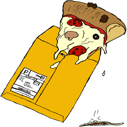
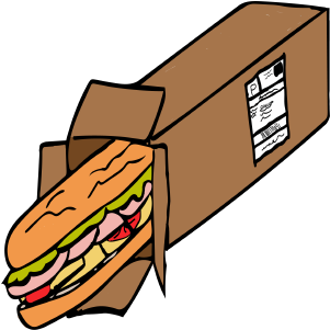
This layout uses Flexbox to keep the Food from E-Bay images and descriptions on the same row, no matter how odd
the subject matter is. The container is set to display: flex, which lets the image and text sit side
by side with consistent spacing and alignment.
Flexbox replaces the older float-based approach and makes it easier to center content, control gaps, and stack elements vertically on smaller screens without completely rebuilding the HTML.
Read more about the project
October 30, 2025
In a real online shop, product cards need to stay balanced as the viewport changes. Here, Flexbox lets each Food from E-Bay “product” grow or shrink while keeping the text grouped with its image, which keeps the layout from collapsing as the window narrows.
Properties like gap, align-items, and flex-direction help control how
these strange grocery boxes line up, so the page still feels intentional even if the food feels questionable.
October 30, 2025
One of the biggest advantages of Flexbox is how easily a layout can switch from stacked to side-by-side. For this project, the same HTML can support a single-column mobile view and a desktop view where the Food from E-Bay boxes and captions sit next to each other.
This makes it easier to focus on the visuals and message of the series without getting stuck fighting the layout. Flexbox takes care of the structure so the design can lean into the humor and uneasiness of buying food from e-Bay.
See how Grid handles the gallery